
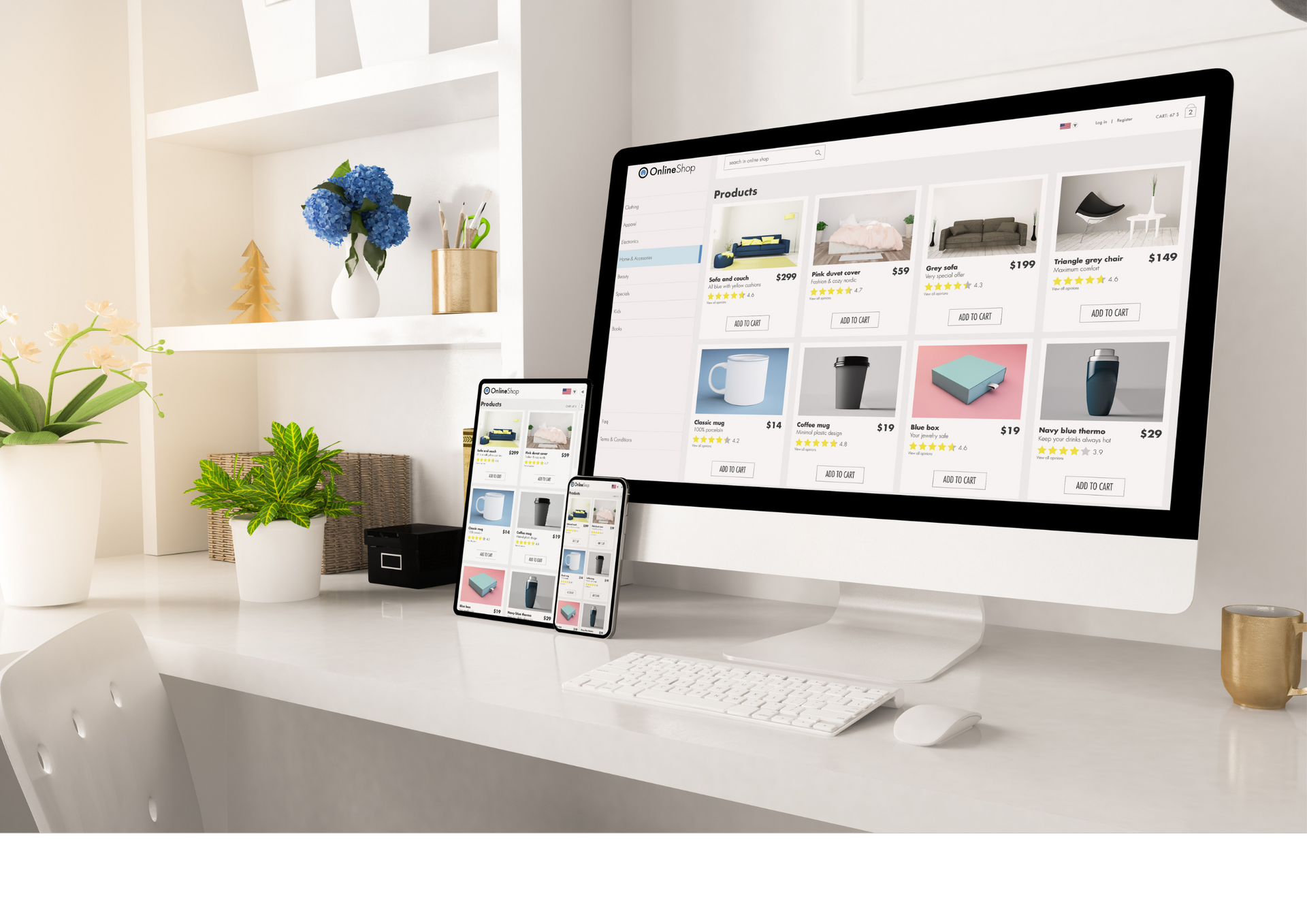
Website navigation is one of the most important factors in user experience. No matter how attractive a website looks, visitors may leave quickly if they cannot find the information they need.
Clear navigation helps users move confidently through a website, discover relevant content, and take meaningful action. For homeware brands, health and wellness businesses, and retail companies in Bradford, strong navigation can directly influence engagement, enquiries, and conversions.
Strategic Web development ensures that navigation systems are built around real user behaviour rather than internal assumptions. When structure, menus, and pathways are planned carefully, websites become easier to use and more effective at supporting business goals.
This article outlines five principles for improving website navigation.
Creating Clear Site Structure
Good navigation begins with clear structure. Pages should be organised logically so users can understand where information is located and how sections relate to one another.
Grouping similar services, products, or resources together reduces confusion and makes browsing easier. A clear hierarchy also helps users predict where they should click next. Strong website development supports this process by creating organised frameworks that remain easy to expand as the website grows.
Designing Menus for Simplicity
Menus should guide users, not overwhelm them. Overloaded navigation menus with too many options can create hesitation and decision fatigue.
Prioritising the most important pages within the main menu helps visitors focus on relevant pathways. Secondary pages can be accessed through supporting navigation where appropriate. A skilled
front end developer ensures that menus remain intuitive and functional across desktop, tablet, and mobile devices.
Improving Mobile Navigation Experience
A growing share of website traffic comes from mobile devices, making clear and efficient navigation essential on smaller screens.
- Navigation should work just as effectively on mobile as it does on desktop.
- Touch-friendly menus make it easier for users to browse quickly.
- Clear icons help visitors understand where to tap next.
- Simplified layouts reduce confusion and improve usability.
- Removing unnecessary steps supports users who are multitasking or travelling.
- Many businesses search for website developers near me after poor mobile navigation affects engagement and enquiries.
Using Internal Links to Guide Users
Navigation extends beyond menus alone. Internal links within page content help users discover related services, products, or resources naturally. Well-placed links guide visitors deeper into the website without forcing them to return to the main menu repeatedly.
This creates smoother journeys and encourages longer engagement. Businesses often work with a website development company to ensure internal linking strategies support both usability and long-term scalability.
Testing and Refining Navigation Over Time
Navigation should evolve as user needs and business goals change. New services, product categories, or content sections may require updates to menus and pathways. Monitoring user behaviour helps identify where visitors become confused or leave the site.
Continuous refinement ensures navigation remains clear as the website expands. Strategic Web development treats navigation as an ongoing performance factor rather than a one-time task, helping websites remain effective over time.
ETA Web Design Bradford
specialises in building websites that combine usability, structure, and long-term scalability. We understand how clear navigation influences customer experience and business results.
Our approach combines strategic planning with practical web development, ensuring every website is easy to use, adaptable, and performance-focused. By prioritising clarity, user journeys, and measurable outcomes, we help businesses in Bradford create websites that deliver consistent results across any location or sector.
New Update on X:
Web development for better website navigation and user experience!